Harley Davidson
How do you get young riders to embrace a bike that’s older than their grandparents?
Scroll ↓
Show them you get why they ride.
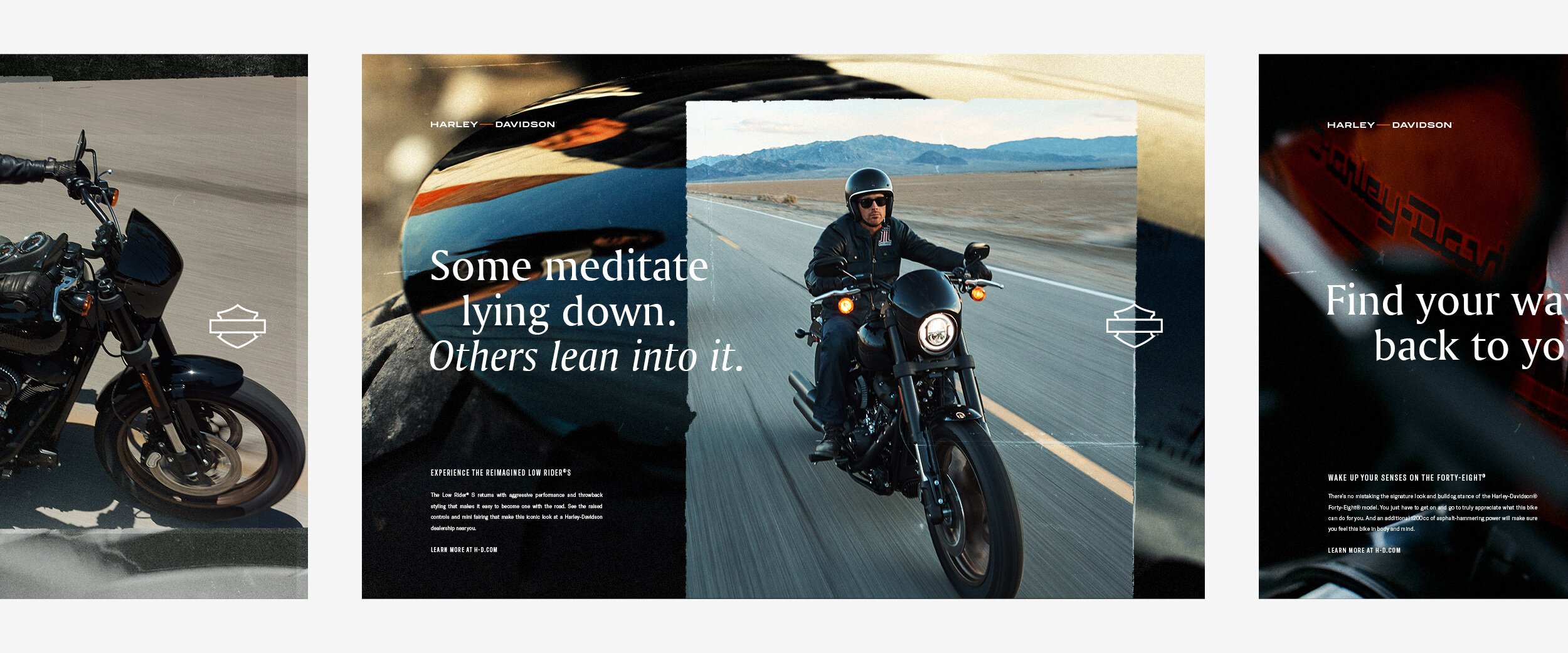
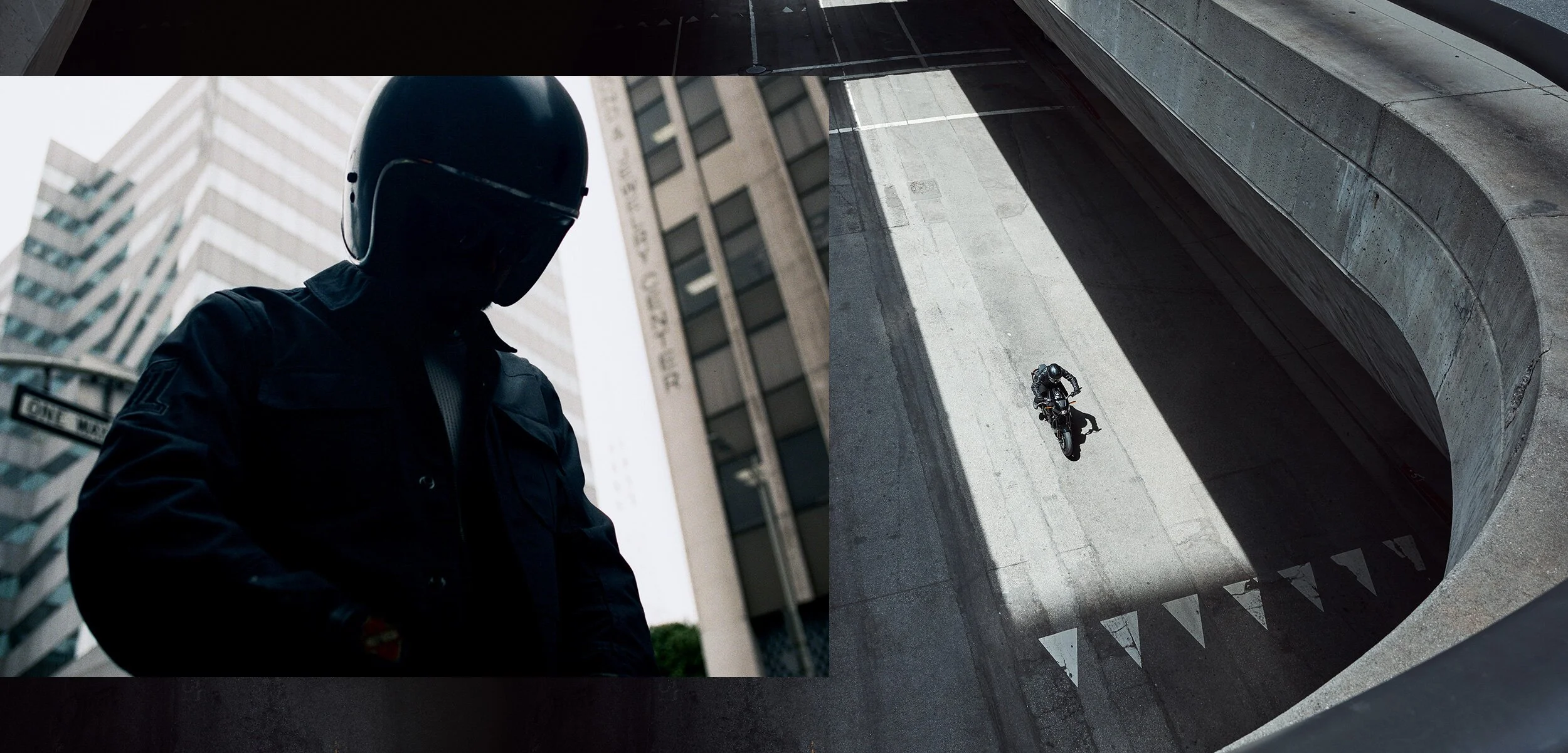
As Harley riders age out of the sport, the brand needed to attract new customers, but being one of the oldest motorcycle brands in the world comes with a lot of baggage. We needed to show young riders that Harley was more than a stereotype. It’s a company that deeply understands why they ride on an emotional level: to escape the crushing demands of the always-on world.
Full-throttle wellness
Our strategy ditched identity as the core of the brand and leaned into the act of riding itself. We repositioned it as a high-velocity act of self care. When you need to clear your head, when you need to ground yourself, when you need an eject button from your feed—riding provides a visceral escape you can’t get anywhere else.

Stripping the brand down to its studs, starting with the iconic bar and shield.
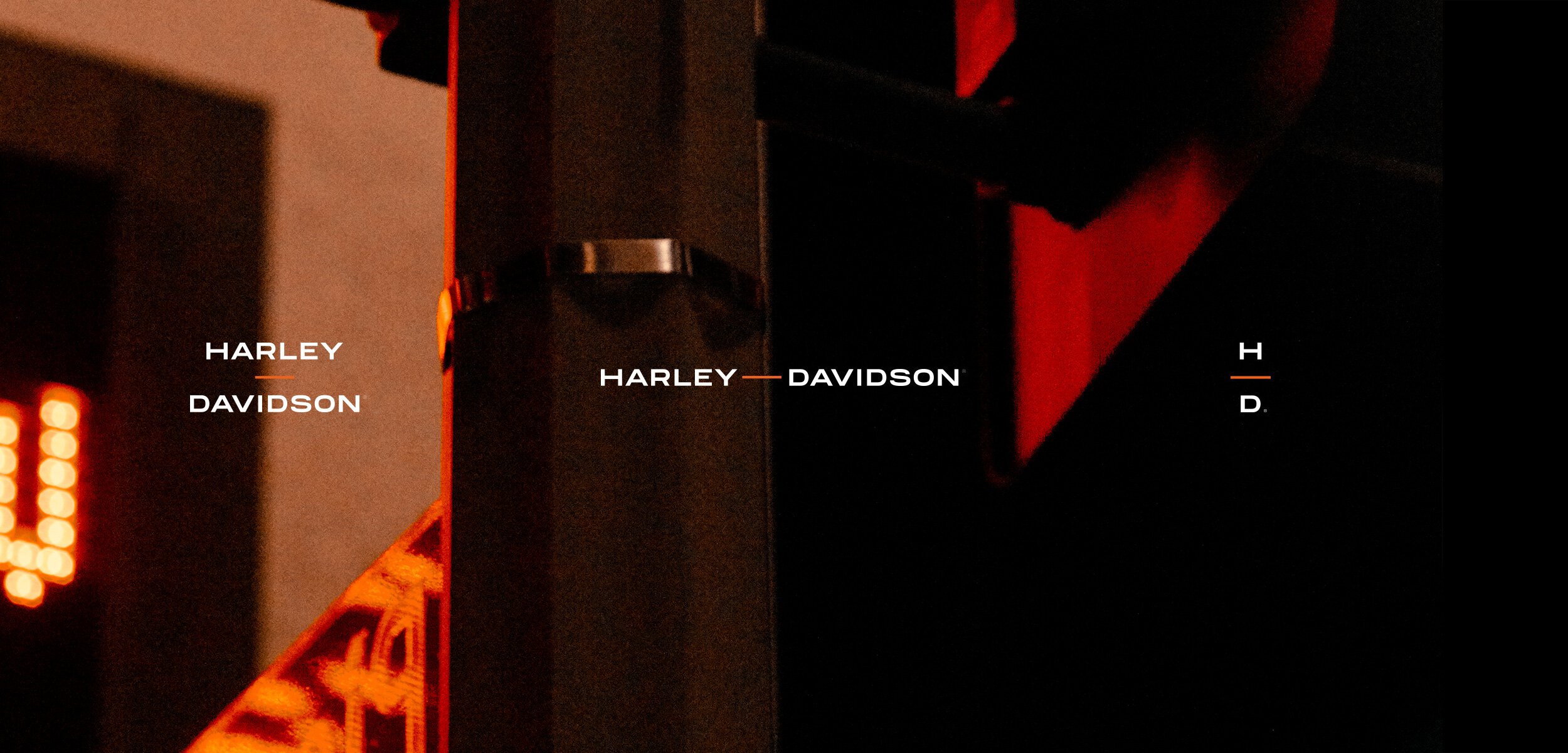
We infused every element of the brand with the clarity and space you get on a ride, starting with the iconic logo, which we simplified to be more fluid.
It’s all a blur.
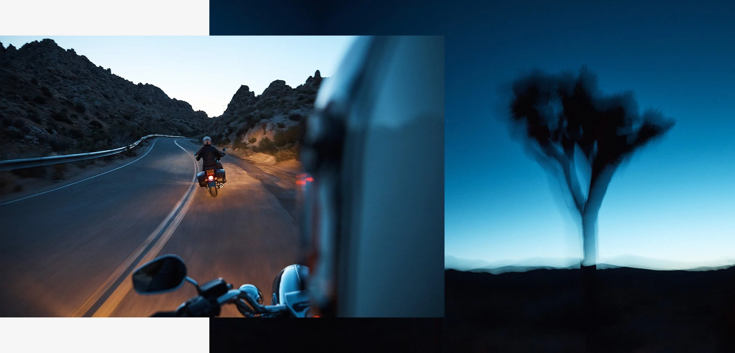
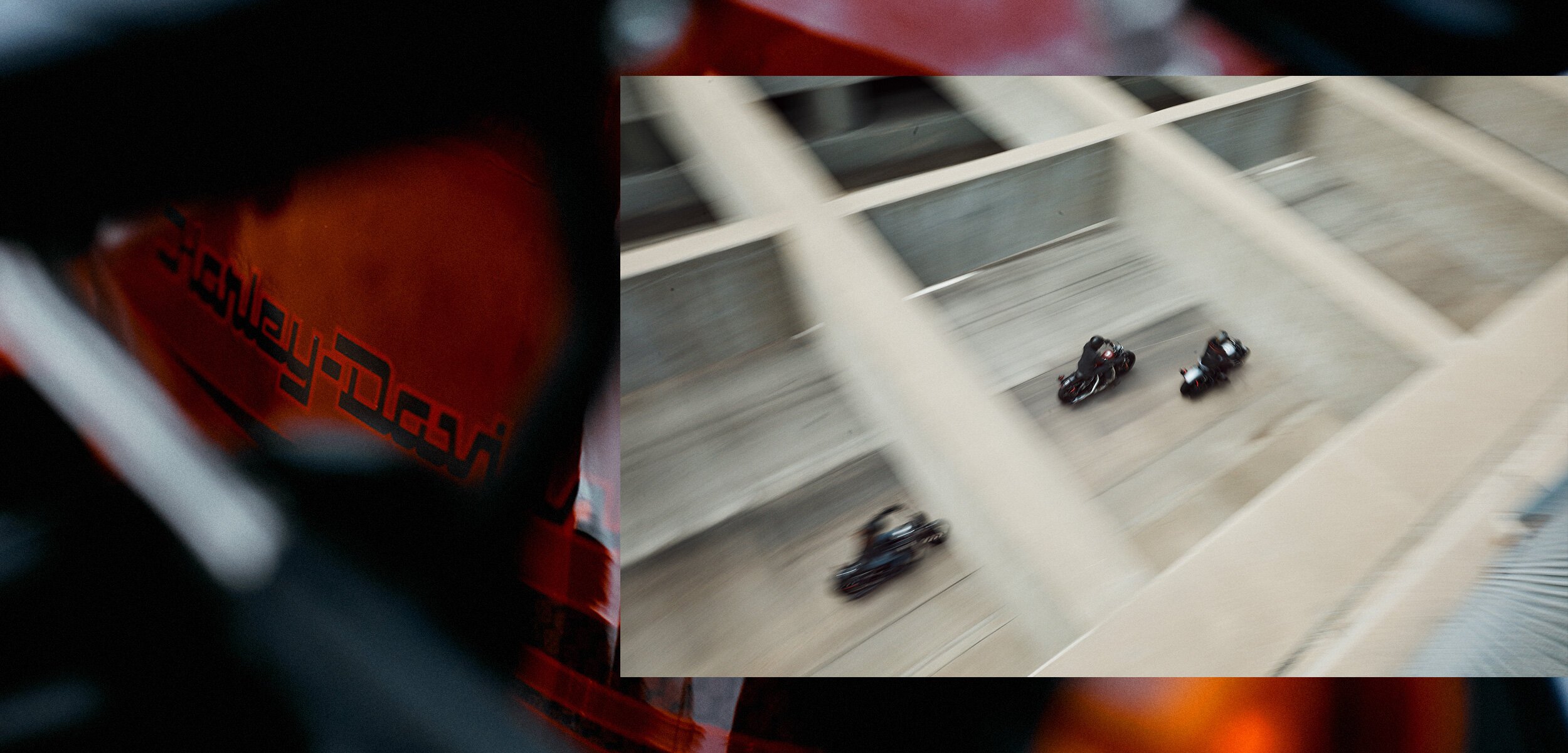
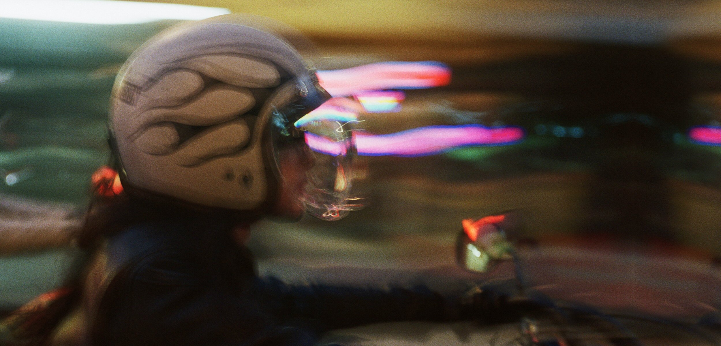
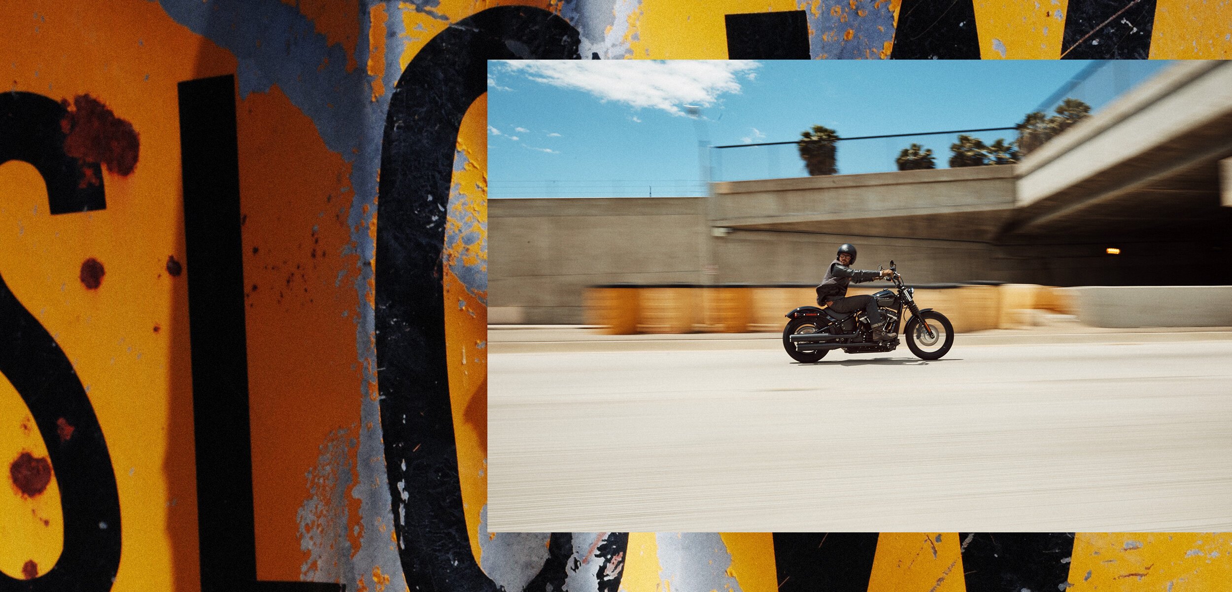
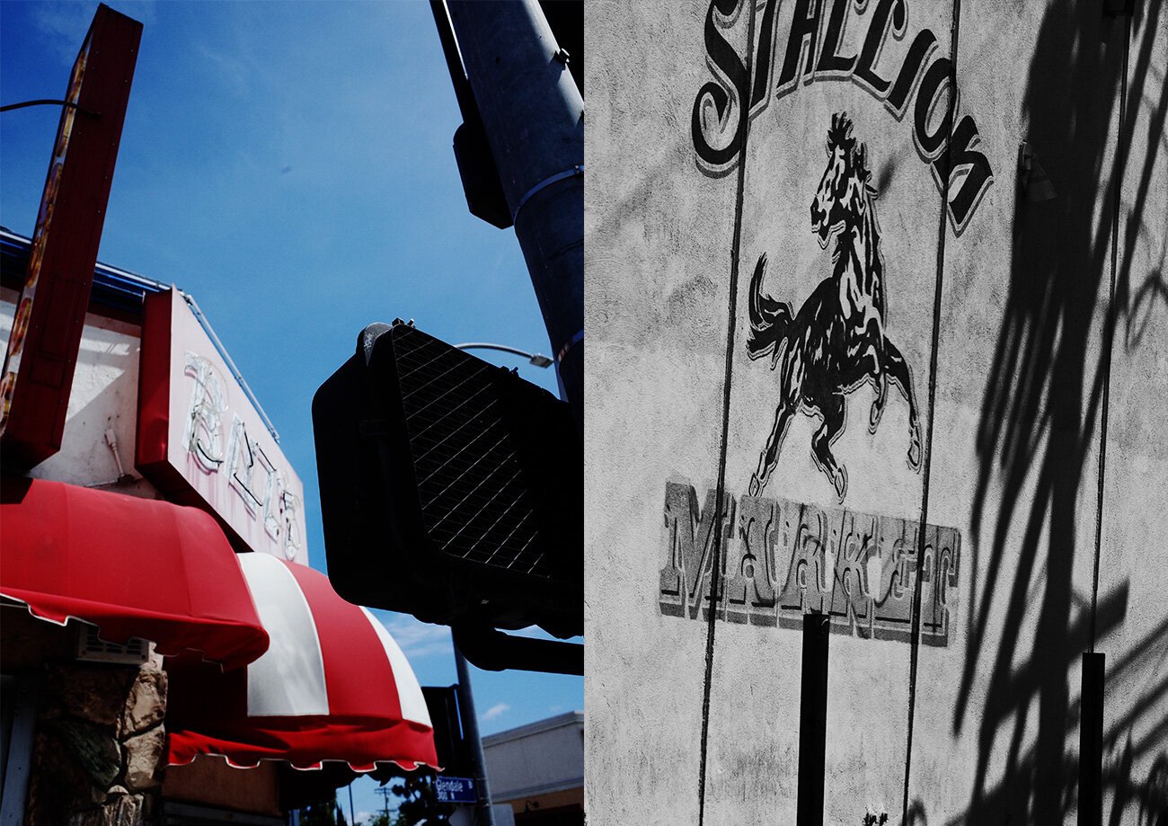
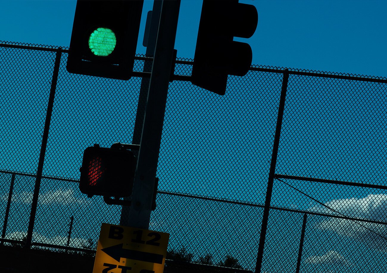
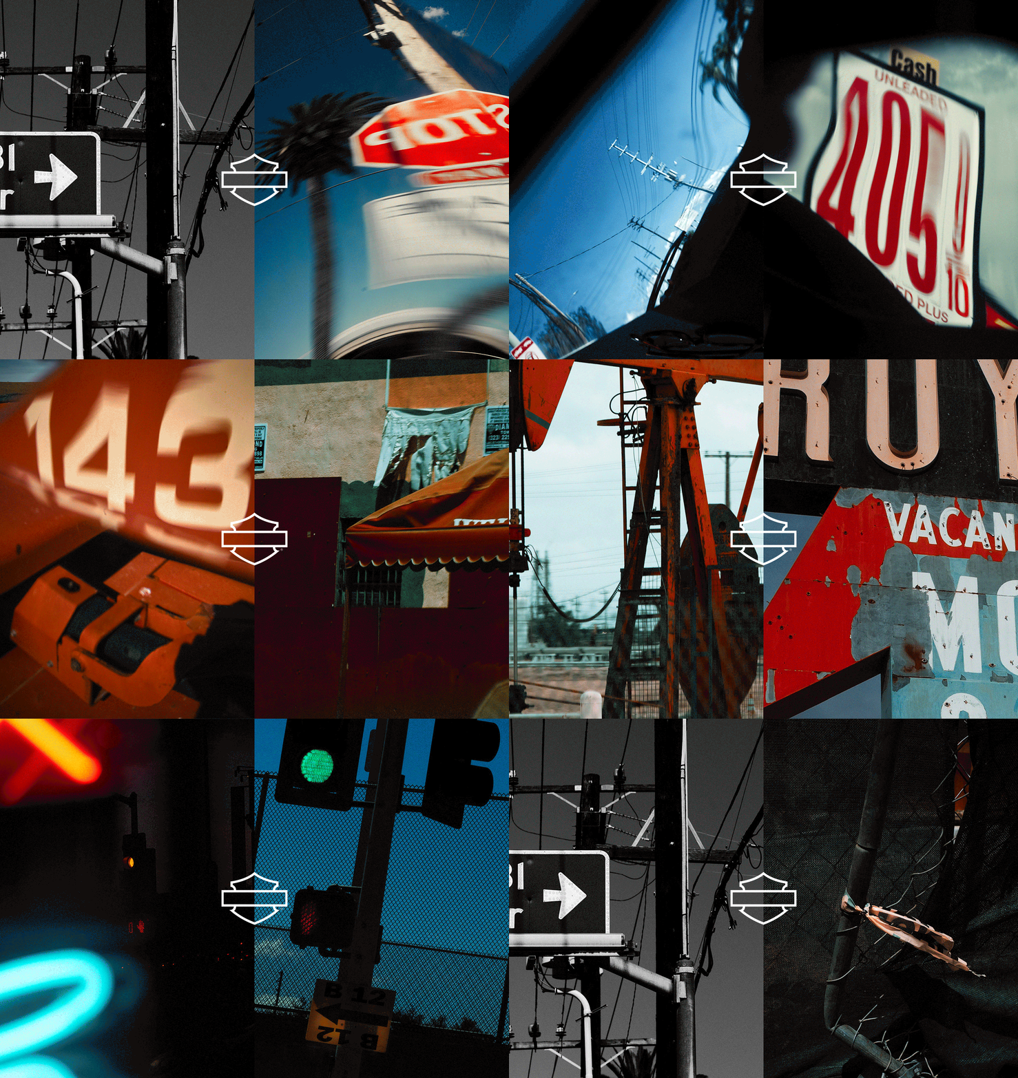
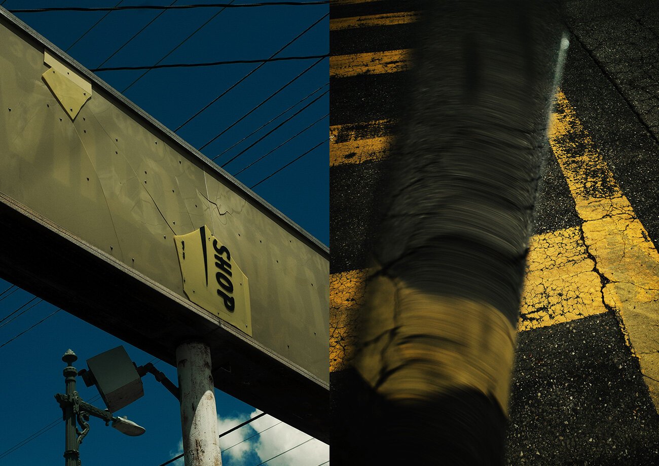
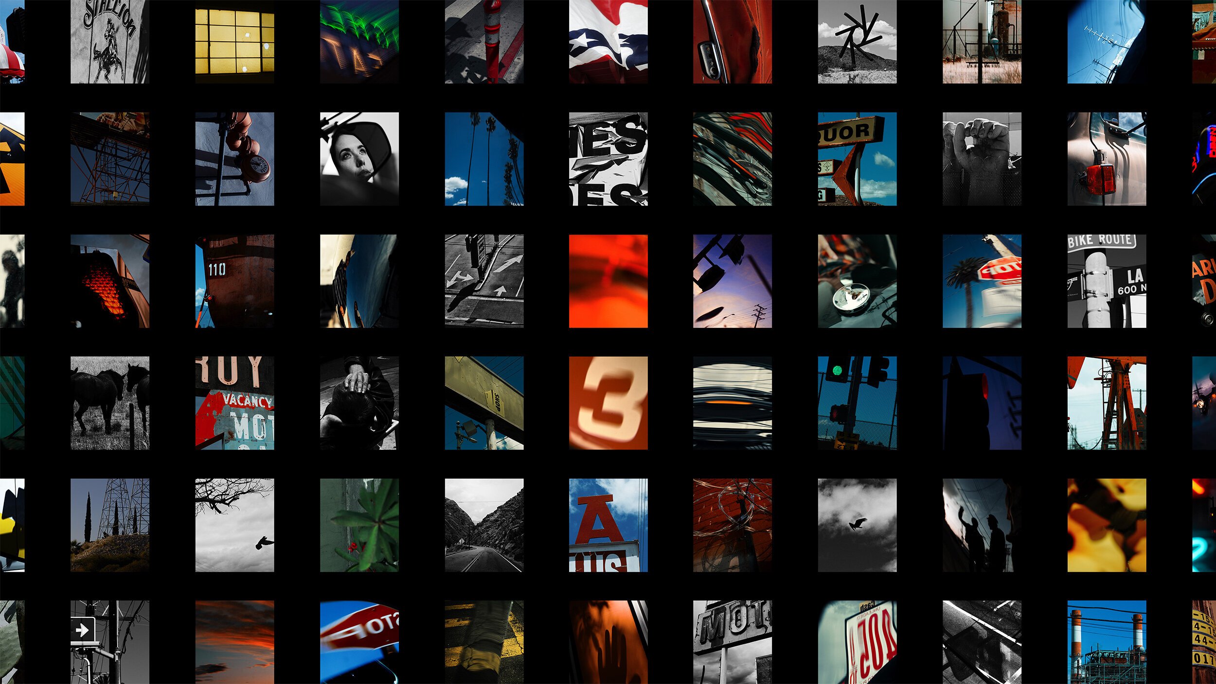
Inspired by the feeling of riding, we updated the brand photography to be more visceral and human. Rigid, posed bike shots were replaced with blurry night skies and peripheral snapshots—momentos from the road.
Leaving stereotypes behind
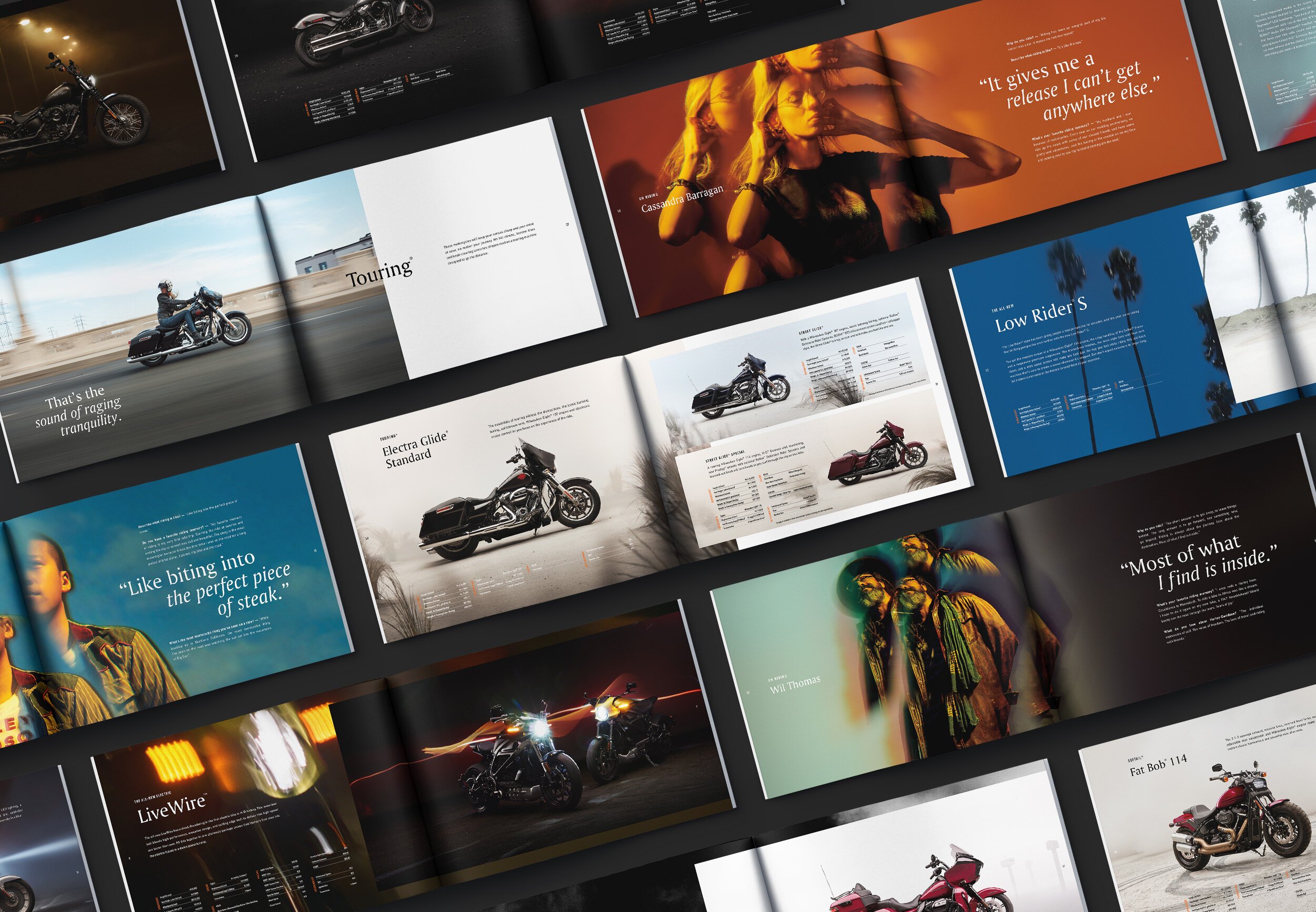
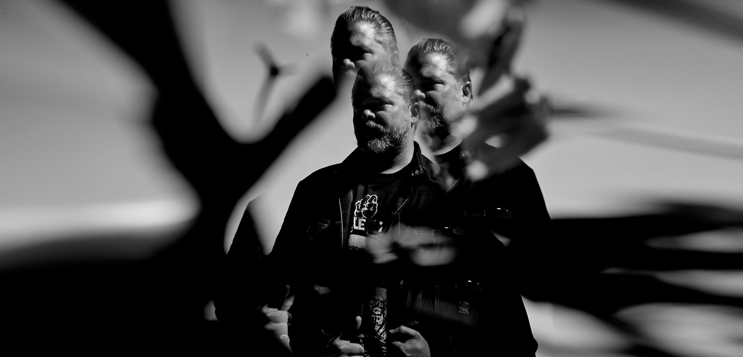
The classic image of a Harley rider is a 60+ white man with a long beard and a mom tattoo. But, Harley is one of the most popular bikes across the globe, ridden by all races, ages and genders. They may look completely different, but they all think about riding as an act of salvation at 60 miles per hour.

Putting it all together
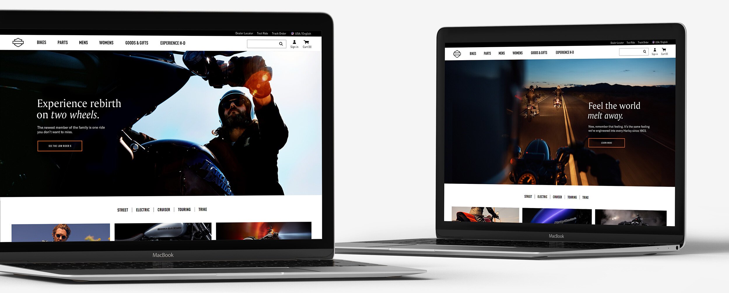
From the logo all the way down to the catalog, online experience, retail locations, and brand advertising, we overhauled the Harley brand and made riders feel seen.
